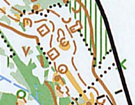
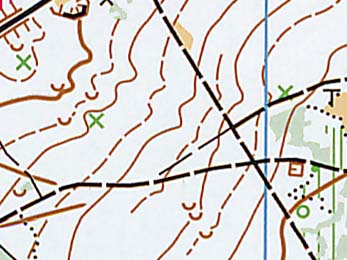
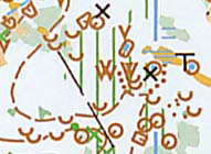
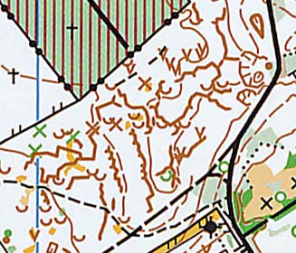
| Generally this map is not sufficiently generalized. |
Too many details make the map unreadable (why not to interrupt the road
symbols at the small tower?).
Overlapping symbols should always be avoided!
|
|
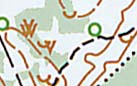
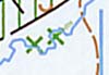
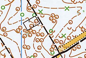
- Why are the index contours interrupted beacuse of the green symbols?
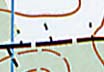
- What are these black lines on the SE corner of the map?
- Contours should never interrupt other contours.
|
|
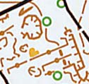
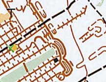
The order of the printed colours is wrong. Why does the green circle overlap
the contours? Why do the north lines interrupt the contours?
The order of the colours should only decide how they are mixed, not which
colour mask out which!!!
The masking that can be observed on this map is not according to ISOM.
|
|
| Very ugly doubled symbol (pit). |
|
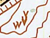
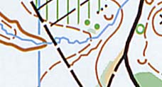
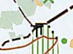
| What is this brown feature? |
|
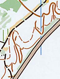
| Very ugly path (?) symbols. |
|
| Mysterious brown features. |
|
| Too many meaningless form lines give wrong impression about the terrain. |
|
| Point symbols and contours overlap each other. |
|
| The depressions are drawn by contours. It would be necessary to fit the
"normal" contour lines not to touch/cross the contours of depressions. |
|
| The normal symbols of earth wall is only rarely used on maps, although
the usage would make maps more legible. |
|
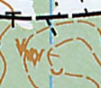
| What is this strange brown line? |
|
| What are these black features? |
|
Contour lines shall not be interrupted when crossing erosion gullies (this
makes the map more legible).
|
|
| This area is not legible. The overall relief can not be seen. Even if
we wouldn't be able to represent all the small details of the gullies, using
the small erosion gully symbol (dotted line) would make this area more legible.
The removal of meaningless form lines would also help. |
|